Tag Archives: color

Drawn to Color

beach front property

Just what was it about this old, weather-beaten shack that kept pulling me back to it, as if by some mysterious, invisible force?

It is one of my favorite photographs from a recent trip to the Caribbean. Okay, I know that seems a little weird, at least I thought so, because in the Caribbean there is a beautiful landscape-seascape at every turn, and so much Color.

In addition my work here at Oak Creek Printworks, I teach Publishing and Prepress as well as the Adobe Create Suite at Moorpark College, a local community college. This prompted me to sign up for the Adobe Creative Cloud. For a flat monthly fee, I now have a “virtual desktop” on the Adobe Creative Cloud Server. There I have access to, not only all of the latest versions of the programs in the Adobe Creative Suite, but easy access to a myriad of tools and videos that help with all things Adobe.

Adobe Creative Cloud Dock

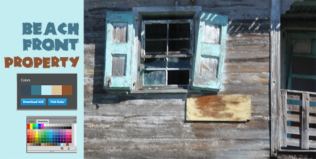
One of the tools on my Creative Cloud desktop is a section labeled “Colors,” where Kuler (pronounced “cooler”) performs an “extraction” on the uploaded image. The extraction draws colors from the image and displays a color palette like the one in the illustration above. The new swatches can then be downloaded and used in the Creative Suite programs. I loaded the Adobe Swatch Exchange (ASE) file into Photoshop and used the new color swatches (the last 4 in the palette) to quickly work color into the “Beachfront Property” headline and background. I selected a typeface the felt like it belonged to the old shack…and that’s when it dawned on me.

Not only was this the identical color palette I had recently chosen when redecorating my kitchen, but it is a color palette that has been recurring in many important ways since my earliest memories, beginning with summer beach vacations, and the colors of my favorite room in my early childhood home. I relate to these colors in a profound way. You might say I’m drawn to them.

So I think these particular colors have just a little to do with my emotional attachment to this out-of-focus, tightly cropped image, which I intend to make into, well, something. Beyond that tiny bit of subjectivity, I will not critique this photograph any further. I’ll leave that to anyone who has read this far!

Not Another Green Marble Background?

For a designer, creating a new look for a green marble background is like bringing out the old bell-bottoms and believing they look as cool as they did in 1969.

Filling a “simple” request can be not-so-simple if you make a lot of blind starts, like spending an hour hunting down an old CD filled with stock marble images, just to find they are in an outdated graphic format.

A second blind start—searching stock images—another hour easily wasted as I realized, why not create an original image? Not only can it be easy, but the price is right. We refurbished our kitchen a few years back, and while out searching for the right granite counter top, I took plenty of photographs of the various granite and marbles, but none were green. Take them into Photoshop, and with a couple of well placed clicks I was able to turn my images into perfectly suitable green marble backgrounds.

gold marble

This is the original photograph of the marble.

green marble

By applying levels to increase the image’s contrast, and then applying a hue and saturation effect, the result is this rich, green marble-like background.

There are only two steps to go from the original photograph of the gold marble to the green. First, I created an adjustment layer for “levels” to increase the image contrast. The adjustment layers are forgiving in that they allow you to manipulate the data at any time without destroying any of the original pixel information.

The second step is to create and adjustment layer for “hue and saturation.” There are three areas that can be changed within the H&S palette, but before changing anything, click on the “colorize” button. This extracts all the color from the image, assigning a default hue to all the pixels, while maintaining their original values.  Next, the hue slider cycles through the “rainbow” — ROY G. BIV (red, orange, yellow, green, blue, indigo, violet) — stop at the desired green hue. The saturation slider adds or subtracts color, and finally the bottom slider lightens or darkens the values.

Of course, to achieve the desired result might require additional steps, depending on the nature of the original image. You might want to add additional layers of color, transparency, contrast, and texture to create a unique effect.

If you want to create a library of backgrounds and textures, do it yourself. Textures exist everywhere, and for every photograph you take, you can manipulate it in an infinite number of ways.

With today’s image editing programs, you don’t have to mortgage your home or rent out your kids to afford amazing software. I’m currently experimenting with an app called Pixelmator, a $15 Photoshop wannabe, and after half an hour of playing (and they call it work), I can say it’s certainly worth the investment. In fact, I’d recommend Pixelmator to any of my beginning design students who have a newer Mac, but can’t afford Photoshop. This app works on my iMac, now that I’ve upgraded to Lion, but Pixelmator will work with OS10.6 or later. With a little coaxing, I could be persuaded to show and tell more about this cool app, Pixelmator.

15 Websites and Magazines for Artists

As an artist it is important for you to keep informed about what the market is up to and where you fit in. Develop a strategy that will allow you to keep abreast of current trends and events. Subscribe to magazines that appeal to you. Subscribe to online newsletters that let you know what is happening in your area. Get yourself on as many social networking sites as you can. Here is a partial list of sites and magazines to get you started:

Continue reading

Bookmarks Can Be Inexpensive, Personal Gift

Turn your artwork into custom-made gifts that fit your budget

by Stephanie Ferguson

In these tough economic times holiday giving can be a challenge. Many people are turning to homemade gifts, and in my opinion a homemade gift is the best kind. Looking for a great, personalized gift that says “I made this just for you”? Looking for something your children can give? Look no further.

bookmarks1 bookmark fan2

In addition to being something everyone needs and uses, bookmarks can be a great way to show off artwork. Besides having your artwork printed, you can use your children’s original art, or they can prepare art on the computer. Another idea is putting together a collage using mixed media. And you can personalize the gift for someone special. Only your creativity limits the final product. Slip the art into a vinyl bookmark sleeve, add a tassel and your task is complete. If you want to protect the bookmark and dress it up as well, save money by purchasing the bookmark sleeve and tassel together as a “bundle.” The more sleeve and tassel bundles you buy, the more you save.

Gift ideas include:

• Stocking Stuffers
• Enclose with gift books
• Children’s gifts to grandparents
• Child’s gift to teacher. Decorate the front and write a poem or message on the back.
• Showcase your own artwork on the front and put your contact information on the back so the bookmark can do double duty as a business card.

When it comes to tassels, Oak Creek Printworks carries more colors than anyone.  Holiday favorites include Tinsel Twist (red and green with gold tinsel), Christmas (combination red and green), Candy Cane (combination red and white), Royal Blue, Red, Green, The Precious Metals set includes Antique Gold, Silver, and Copper.

Our bookmark sets include the plastic sleeve, and a tassel. You can buy the card blanks separately. If you are interested in custom printed bookmarks, we can do that for you too!

We’d love to hear from you. Please leave a comment on this article by clicking on “Add Comment” below, or send us photos of your creations (jpeg format, 72 dpi). Perhaps your work will be posted on our blog!

A little help with artist’s block

barbara

Ever suffer from creative or artist’s block? You are not alone in this. It happens to all creative people actually, including visual artists, poets, designers, musicians and writers.

One of our clients, Barbara Shannon, has developed a terrific resource book that can act as a creativity catalyst. This book is often used in public schools and for homeschooling art courses, and has been designed as an introduction to art media, but it can also expand any artist’s knowledge and help break that frustrating creative block.

The book, Exploring Art Media, introduces the incredible variety of media, materials, tools, and techniques available to the artist.  It covers color & design, drawing, commercial art, cartooning, painting, three dimensional art and arts/crafts. There is also a companion California Teachers Guide, for those artists who also teach.

Along with media exploration, the book teaches:
* Observation and drawing skills
* Color manipulation
* Implementation of art elements, concepts, and principles
* Art appreciation
* Environmental awareness
* Historical influences
* Creative thinking
* Painting techniques
* Sculpting methods

Check it out for yourself.

eam_book