GR M24 Publishing and Prepress
CRN 30032
Thursdays, 6:00pm – 10:50pm
INSTRUCTOR: N. Haberman
Author Archives: Nancy Haberman
Featured Artist Update
Mark & Holly Jansen (2004)
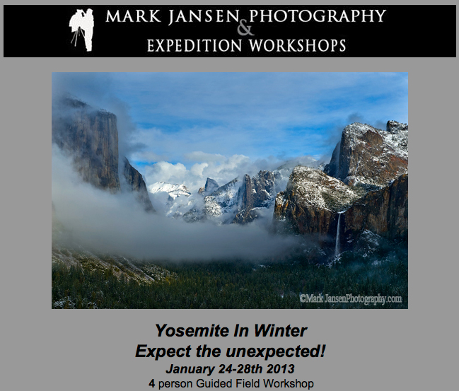 Mark Jansen, along with his wife Holly, run Mark Jansen Photography and Jansen Photo Expeditions. Jansen Photo Expeditions specializes in bringing their clients to beautiful areas of California and teaching them how shoot landscape photography. The tours include Big Sur, Eastern Sierra and Yosemite multi-day tours for SLR Photography. They have also been teaching local one-day workshops for special events including instruction for iPhone and SLR Photography in Ventura, Santa Barbara, and San Luis Obispo Counties. Plans for the future include photo tours of the Southwestern United States and Tanzania, Africa.
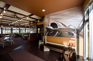
Mark Jansen Photography specializes in large format murals and canvas prints for commercial applications. Mark has his images in local businesses and commercial spaces including the Way Point Café in Camarillo, Volvo Monitoring and Concept Center and Development in Camarillo, Sysco Food Services in Oxnard, and the Santa Maria Airport Terminal.
Celebrating 10 Years Featuring Artists
Here at Oak Creek Printworks (OCPW) we began with an idea—help artists who are making greeting cards and prints market themselves using the internet. Starting in 2003 with an Etsy-like site, we tried helping artists sell their artwork, but soon found that we could be of more service to more artists by searching out the best packaging, presentation and display items and assembling them on a single, easy-to-use online site.
During the past ten years, we have featured dozens of artists and continue to do so, spotlighting three to four each year. As we approach 2013 and the year of our 10th Anniversary, we thought it would be fitting to provide an update to let you know what they are up to today. We have devoted six pages in our current print catalog to our former featured artists, and will post highlights periodically on the OCPW Blog.
Angela Sharkey (2009)
As an artist I am thrilled to be continuing my work as an art curator for the Tri-Mission Art Gallery at the US Embassy in Rome, Italy. This job has proven to be very rewarding and I have grown as an artist myself.
I have gained a new perspective on art and life as an artist as I listen with excitement to the gallery artists as they explain their mediums with such passion—whether it be sculpture, painting, photography, mixed media, or textile art.
Promoting these artists and their art to the US Embassy community brings people together and has been an inspiration for everyone involved.
On March 8th I was honored to be a part of the Women’s Day celebration at the French Embassy, Palazzo Farnese in Rome with my art work.
For this show I painted a new abstract painting “My Garden” on a 100mx100m canvas. This painting was painted during the big snow storm in Rome 2012. I was 1 of 10 international women artists representing the power of women for positive change in our world. It was a wonderful experience to show my work in such a beautiful building surrounded by history and talented women.
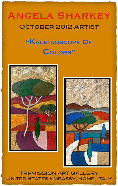
My next solo show will be October 2012 at the Tri-Mission Art Gallery, Rome, Italy. In the upcoming year I look forward to working with mosaics and painting in the country side of Italy with the warm sun on my face.
Rack up the Discounts
 Oak Creek Printworks has a Facebook page with content that doesn’t always get published on our blog.
Poke around and you may discover a discount or two.
Thinking of making a purchase? Become a Facebook Fan and get a 20 percent discount right away.
Try a #10 Greeting Card for Panorama Images
Wondering what to do with your auto-stitched and panorama photos? Bookmarks aren’t the only game in town. Long rectangles, either vertical or horizontal, transform into attractive greeting cards when presented on a #10 business sized greeting card. That’s what Angela Sharkey, former Featured Artist, did recently with some of her latest paintings. Rather than try to make the oblong shapes work on an A7, A6, or A2, more traditional greeting card shapes, Sharkey opted for the less commonly used #10 size.
Photoshop
To set up your card in a Photoshop or other raster-oriented software, create a new document that is 10 inches wide by 8.75 inches in height. A document this size will accommodate the trim marks needed to accurately cut the card to size. If you want your image to bleed; that is, print all the way to the trimmed edge, it is important to extend your image beyond the trim marks by .125-inch. The bleed setting is represented here by the red line. The actual card trims to 9.25-inches wide by 8-inches in height. The trim is represented by the black line. A #10 card folds at the halfway, or 4-inch mark, represented here by the cyan (blue) line. All of these lines (including the black trim marks that fall at the four corners of the black trim line) are non-printing and part of the template. Simply redraw onto a printing layer the eight trim marks shown at the four corners.
InDesign or Illustrator
If you use Adobe’s InDesign or Illustrator, set up a new document that is 9.25 inches wides and 8 inches in height. If your image will bleed, in the document setup options, create a bleed of .125 inch. Once the page is set up, drag a guide from the ruler to the 4-inch mark on the vertical ruler to indicate where the card will fold. To print, export your file to a print resolution .pdf with crop marks and you’re ready to rock ‘n’ roll.
Angela Sharkey is the curator of the Mel Sembler Gallery in the U.S. Embassy, Rome, Italy. View more of Angela’s art here.
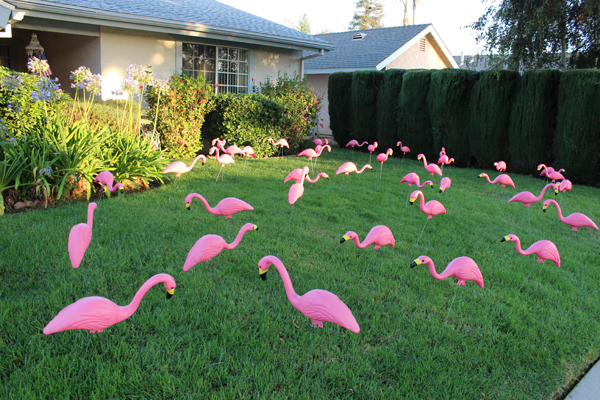
Flash from the Past – Pink Flamingos Thirve
Not Another Green Marble Background?
For a designer, creating a new look for a green marble background is like bringing out the old bell-bottoms and believing they look as cool as they did in 1969.
Filling a “simple” request can be not-so-simple if you make a lot of blind starts, like spending an hour hunting down an old CD filled with stock marble images, just to find they are in an outdated graphic format.
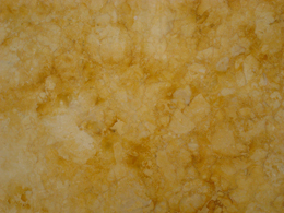
A second blind start—searching stock images—another hour easily wasted as I realized, why not create an original image? Not only can it be easy, but the price is right. We refurbished our kitchen a few years back, and while out searching for the right granite counter top, I took plenty of photographs of the various granite and marbles, but none were green. Take them into Photoshop, and with a couple of well placed clicks I was able to turn my images into perfectly suitable green marble backgrounds.

By applying levels to increase the image’s contrast, and then applying a hue and saturation effect, the result is this rich, green marble-like background.
There are only two steps to go from the original photograph of the gold marble to the green. First, I created an adjustment layer for “levels” to increase the image contrast. The adjustment layers are forgiving in that they allow you to manipulate the data at any time without destroying any of the original pixel information.
The second step is to create and adjustment layer for “hue and saturation.” There are three areas that can be changed within the H&S palette, but before changing anything, click on the “colorize” button. This extracts all the color from the image, assigning a default hue to all the pixels, while maintaining their original values. Next, the hue slider cycles through the “rainbow” — ROY G. BIV (red, orange, yellow, green, blue, indigo, violet) — stop at the desired green hue. The saturation slider adds or subtracts color, and finally the bottom slider lightens or darkens the values.
Of course, to achieve the desired result might require additional steps, depending on the nature of the original image. You might want to add additional layers of color, transparency, contrast, and texture to create a unique effect.
If you want to create a library of backgrounds and textures, do it yourself. Textures exist everywhere, and for every photograph you take, you can manipulate it in an infinite number of ways.
With today’s image editing programs, you don’t have to mortgage your home or rent out your kids to afford amazing software. I’m currently experimenting with an app called Pixelmator, a $15 Photoshop wannabe, and after half an hour of playing (and they call it work), I can say it’s certainly worth the investment. In fact, I’d recommend Pixelmator to any of my beginning design students who have a newer Mac, but can’t afford Photoshop. This app works on my iMac, now that I’ve upgraded to Lion, but Pixelmator will work with OS10.6 or later. With a little coaxing, I could be persuaded to show and tell more about this cool app, Pixelmator.
Architecture and Graphic Design Play Off One Another
Each time I travel I make new discoveries, and often, insights and inspiration comes only once I’m back home and have had a chance to unwind and process the whirlwind adventures.
On this trip which began on the St. Lawrence River in Montreal, Canada, I became particularly focused on the art and design in architecture (probably because there wasn’t much wildlife or sport activities in our itinerary). I found the range in age and architectural styles to be visually stimulating without appearing to end up in a hodge-podge of visual clutter. Continue reading
Have a Safe and Sane Holiday
I’m a Photo Horder

I was pretty sure that among the 200-some-odd photos I had taken, there had to be an octopus somewhere.
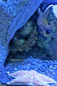
By opening up the shadow areas and toning down the highlights in iPhoto, the values are redistributed to more closely resemble the actual scene. However notice the reflection in the lower left quadrant of the screen.
In the small dark cavern, I would have completely missed the fact that the octopus was there at all had I not made the quick adjustments that open up the shadow details. I performed the adjusted preview in iPhoto on my Macintosh, but Microsoft’s comparable software is Windows Photo Gallery.
I learned lots of valuable lessons in photojournalism classes, many long forgotten, but a couple of lessons really stuck. Thirty years ago when, as students, we were advised to Shoot a lot, our biggest complaint was the cost of film. Today, the cost of digital equipment pales when compared to film and processing costs, so I was surprised to learn that one of my companions on a day-long adventure to the Aquarium of the Pacific was throwing away photos after she previewed them on her iPhone, deciding they didn’t “turn out.” I wondered how it was possible to make such a quick decision about the images under such poor conditions and on such a small screen.
The next day, I showed my companion a rough edit slide show of my 230 images. I put them up on the big screen tv. She, on the other hand, had only 13 images, which we viewed on her iPhone. Granted she’s not a fanatic like me, and didn’t shoot as much as I did, but I can’t help by thinking about the photos she threw away. “What if there were details in the image that she missed on the small preview screen?” I wondered. “What if she could adjust her lighting after the fact?”

The reflection in the previous images has been replaced using the “content-aware” feature in Photoshop.
My first task after downloading photos to the computer is to make preliminary adjustments to the tonal values in the images. It’s a relatively “quick” and painless process, and I finished this batch in about 2 hours, or about 30 seconds per image. Unless you are serious about photography, you might unwittingly skip this most critical step, so that’s where the hording comes in to play. Don’t throw away any photos before you perform a quick adjustment to the image’s tonal values.
In the edited photo, the reflection in the lower left is more obvious than before, so I bring my photos into Adobe Photoshop where I make all the actual refinements and adjustments. To eliminate the glare, I made a feathered rectangular selection and filled the area using the “content-aware” feature, which gathers data from nearby pixels to simulate the surroundings.

