Tag Archives: typography

Flair Magazine Annual is Back in Print

Flair Magazine 1953 Annual

Left is the original 1953 Annual, and right is a reprinted compilation of the critically acclaimed magazine.

While out and about last weekend I happened to wander into a Barnes & Noble bookstore.

As usual, I found myself in the Graphic Design section, and my attention was immediately drawn to a large red volume on the top shelf.

Pre-ecommerce, I had searched unsuccessfully for another copy, wondering if the magazine had been published for more than just one year. The volume in B&N was confined in a clothbound box and shrink-wrapped, so there was no opportunity to browse its pages.

Knowing Flair was again available, I checked it out on Amazon. Still, no opportunity to flip through the pages but with plenty of copies available, I snatched up a cheap one just so I could cut out the uniquely designed and printed pages.

Flair was quite innovative and was said to be “the first magazine that became an art form,” featuring the work of Salvador Dali, Matisse, George Bernard Shaw and Walker Evans to name just a few.

According to the Amazon description of the new publication, “this facsimile edition offers the same ingenious bookmaking of its predecessor, including multiple gatefolds with die-cuts, booklets, and accordion folder leaflets.”

If you’re a fan of uniquely printed art, you might pick up a copy of the Flair Annual 1953 while it’s still available.

Delicate Balance

This image was cropped to a square to ready it for a square greeting card design.

This image was cropped to a square to ready it to print a square greeting card.

A tiny flying insect that I called a “fairy-fly” landing on the flowering Nandina, aka Heavenly Bamboo, inspired me to do a quick photo shoot on my lunch hour last week.

“No matter the time you live, no matter who, or what you are, every one and every thing is in delicate balance.” Should I add typography to this image? What words? Different words? The jury is out. What do you think?


Type Machinations for the Typophile in You

TypoPaint portrait
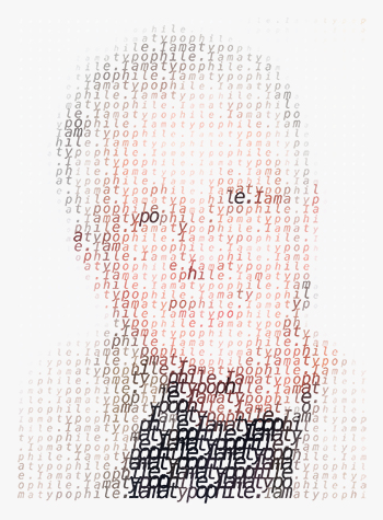
Searching for a definition of “typophile,” I ultimately found one that suited my purpose at Urban Dictionary, which, aside from its definition of typophile, is worth further exploration and I recommend you do so.

Suffice it to say, I am a lover of type, one might even say, I am obsessed with type. I’ve been that way ever since I was a child, and I suppose I’ll always love type.

Which explains why I was intrigued by an article for a Photoshop filter that aids in creating illustrations using, you guessed it—type.

It’s amazing how much creativity and technology programmers have packed into Typo-Painter. Illustrations like you see here can take minutes, instead of hours or days.

Typo-Painter is a fun little Photoshop filter that produces a typographic representation from any raster image. Of course the first thing I thought of Typo-Painting was myself, but people are obvious. Typo-Painter can be used on any raster image, using customizable text. It has a simple interface window for font, horizontal resolution and size. In all, a few simple controls yield a multitude of possibilities. Specially priced at $5 on Mighty Deals, it just might be worth a try.


Flowers, Color, Form Background for Business Card

Graphic designers have lots of problems. With every job we accept we’re presented with problems that are begging for solutions. Recently I was presented with a problem…a purple and green flower for a business card for a massage therapist in the middle of winter…in Southern California. No sweat.

lily of the nile

This is the full frame of the image that became the foundation for the business card.

When I took a series of digital photos on the macro setting, I was thinking about colors (purple and green) and holding still enough to focus the camera on a target that was swaying in the breeze. I wasn’t worrying about composition. Just keep the flowers in the frame before the wind catches them.

I had no idea if these Lily of the Nile would have any chance of working on a business card. I had taken the photos weeks before, and when it came time to buckle down and create the image that would carry the business card, I found my answer by looking at the flowers, not as a whole, but for their “parts.” Perhaps there is just a small part of the image that contains the necessary elements to play a supporting role to the typography?

In order to isolate just the right section of the image, I worked in Adobe Photoshop, but most image editing software has a cropping tool or a selection tool with the ability to crop to a selection. In Photoshop, I fixed the width, height and resolution of the cropping tool to 3.75 inches by 2.25 inches, 300 pixels per inch, adding one eighth of an inch to all four sides to allow for a bleed. When fixing a cropping area, the size of the area can change, but the correct proportions remain constant.

Photoshop's cropping tool can isolate a precise area, resize and resample the pixels to the desired resolution in a single step.

Once a specific area of the image is isolated and cropped, that segment of the photo now stands alone at the correct size and resolution to become a unique background for the business card. The same image could just as easily be cropped and sized for greeting cards, postcards or bookmarks.

Typography is always a challenge. When white type is reversed out of a background, in this case, a moderately busy background, it begins to get lost. It’s almost gobbled up by the very background that’s intended to support the type.

To prevent the white type from becoming too difficult to read as it moves over alternating light and dark leaves or purple petals, a dark green is sampled from the background and used to give it an “outer glow” effect. If reverse type is placed over a purple petal, sample a slightly darker purple for the outer glow to allow it to “pop” off the background.

type before outer glow

type after outer glow is applied

Because we designers are never satisfied with just one version of our layout, I used two different photos with a variety of type alignments before sharing them with the client.