Tag Archives: Creativity

Flair Magazine Annual is Back in Print

Flair Magazine 1953 Annual

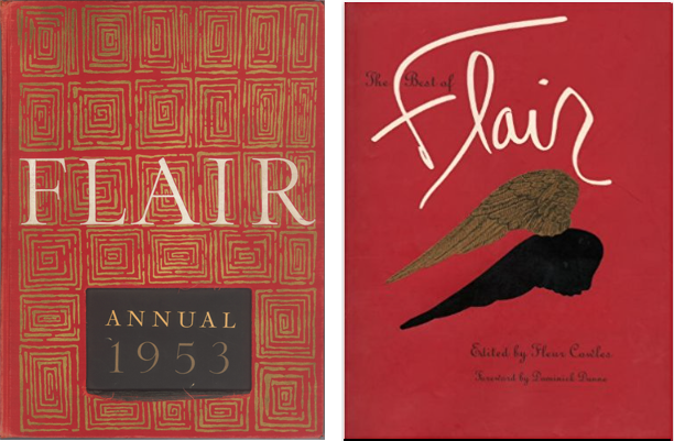
Left is the original 1953 Annual, and right is a reprinted compilation of the critically acclaimed magazine.

While out and about last weekend I happened to wander into a Barnes & Noble bookstore.

As usual, I found myself in the Graphic Design section, and my attention was immediately drawn to a large red volume on the top shelf.

Pre-ecommerce, I had searched unsuccessfully for another copy, wondering if the magazine had been published for more than just one year. The volume in B&N was confined in a clothbound box and shrink-wrapped, so there was no opportunity to browse its pages.

Knowing Flair was again available, I checked it out on Amazon. Still, no opportunity to flip through the pages but with plenty of copies available, I snatched up a cheap one just so I could cut out the uniquely designed and printed pages.

Flair was quite innovative and was said to be “the first magazine that became an art form,” featuring the work of Salvador Dali, Matisse, George Bernard Shaw and Walker Evans to name just a few.

According to the Amazon description of the new publication, “this facsimile edition offers the same ingenious bookmaking of its predecessor, including multiple gatefolds with die-cuts, booklets, and accordion folder leaflets.”

If you’re a fan of uniquely printed art, you might pick up a copy of the Flair Annual 1953 while it’s still available.

Following the Dream on Throwback Thursday

back-to-school

Very few people understood what we Mac Fanatics were up to in 1987 (let alone 1985), but I was following my dream of designing and printing from the desktop. The following month I made the business official and called myself Desktop Design. Today is little Joey’s 36th birthday. He currently works for Disney Studios as a Global Analyst. Happy Birthday, Joey!

Broaden your vision with panoramas and apps

Bryce Canyon National Park in Utah takes on an other-worldly landscape, captured here in 11 different photos. I walked away from the computer for a couple of hours while Photoshop’s Photomerge toiled away. The composite yielded a file nearly a gigabyte in size with a remarkable amount of detail. The sweeping landscape’s curved edges may bother some, but, in my opinion they add to the drama.

Bryce Canyon National Park in Utah takes on an other-worldly landscape, captured here in 11 different photos. I walked away from the computer for a couple of hours while Photoshop’s Photomerge toiled away. The composite yielded a file nearly a gigabyte in size with a remarkable amount of detail. The sweeping landscape’s curved edges may bother some, but, in my opinion they add to the drama.

Looking to make your images unique? Want to see things from a new perspective? Try experimenting with Photoshop’s Photomerge feature or AutoStitch app to combine numerous images into a single wide angle view. It’s all automated. Just select the images you want to merge, sit back, and let Photoshop do the rest.

buckwheat and bee
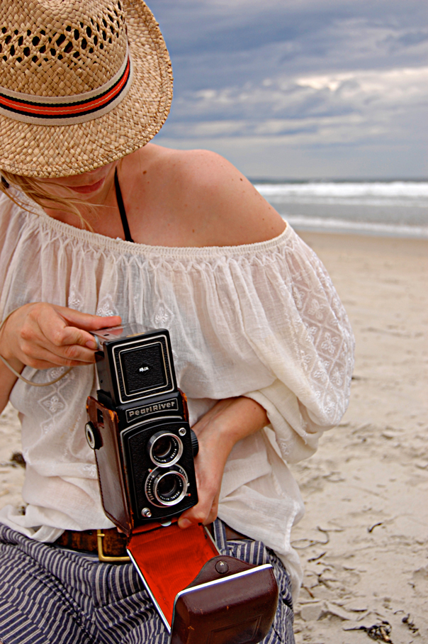
Perhaps you’re looking for something a little more retro. Thanks to the new digital cameras and Smartphones, we’re able to capture well-lit, sharp focus images, so what’s the big deal? Anyone can take “nice” pictures these days. So, let’s look at images differently and carefully mess them up like we used to do by accident.

After reviewing my photos of the busy bees, I realized that the plants they were all attracted to were buckwheat plants. So, I decided to grunge up the photo with an app and create the masking tape label with “B is for…”, surprise, not bee. Two apps were used in the creation of the photo—Pic Grunger and Labelbox.

Want to learn more about the phone apps? Check out former OCPW featured artist, Holly Higbee-Jansen’s Photographic Explorations. Here you’ll learn about Holly’s favorite phone apps, as well as online and in-person workshops and photography coaching.

I’m a Photo Horder

unedited octopus

I was pretty sure that among the 200-some-odd photos I had taken, there had to be an octopus somewhere.


octopus, starfish

By opening up the shadow areas and toning down the highlights in iPhoto, the values are redistributed to more closely resemble the actual scene. However notice the reflection in the lower left quadrant of the screen.

In the small dark cavern, I would have completely missed the fact that the octopus was there at all had I not made the quick adjustments that open up the shadow details. I performed the adjusted preview in iPhoto on my Macintosh, but Microsoft’s comparable software is Windows Photo Gallery.

I learned lots of valuable lessons in photojournalism classes, many long forgotten, but a couple of lessons really stuck. Thirty years ago when, as students, we were advised to Shoot a lot, our biggest complaint was the cost of film.  Today, the cost of digital equipment pales when compared to film and processing costs, so I was surprised to learn that one of my companions on a day-long adventure to the Aquarium of the Pacific was throwing away photos after she previewed them on her iPhone, deciding they didn’t “turn out.” I wondered how it was possible to make such a quick decision about the images under such poor conditions and on such a small screen.

The next day, I showed my companion a rough edit slide show of my 230 images. I put them up on the big screen tv. She, on the other hand, had only 13 images, which we viewed on her iPhone. Granted she’s not a fanatic like me, and didn’t shoot as much as I did, but I can’t help by thinking about the photos she threw away. “What if there were details in the image that she missed on the small preview screen?” I wondered. “What if she could adjust her lighting after the fact?”

The reflection in the previous images has been replaced using the “content-aware” feature in Photoshop.

My first task after downloading photos to the computer is to make preliminary adjustments to the tonal values in the images. It’s a relatively “quick” and painless process, and I finished this batch in about 2 hours, or about 30 seconds per image. Unless you are serious about photography, you might unwittingly skip this most critical step, so that’s where the hording comes in to play. Don’t throw away any photos before you perform a quick adjustment to the image’s tonal values.

In the edited photo, the reflection in the lower left is more obvious than before, so I bring my photos into Adobe Photoshop where I make all the actual refinements and adjustments. To eliminate the glare, I made a feathered rectangular selection and filled the area using the “content-aware”  feature, which gathers data from nearby pixels to simulate the surroundings.

New Pastel Stretch Loops Complete Spring Note Card Sets

stretch-loop-yellow

Matte Yellow Elastic Stretch Loop shown around a clear plastic A2-1/2BOX. The single box of 8 cards and envelopes is displayed on a Clear Acrylic Small Card/Print Stand, CASPS.

Springtime is just around the corner, and Oak Creek Printworks wants to help you with your holiday packaging by introducing the 10-inch elastic stretch loop in two new spring colors. We’ve added a matte yellow and a matte lavender to the choices for dressing the A2 size note card box.

stretch-loop-lavenderLast year, we wanted to encourage our customers to try the metallic blue, purple, and copper, and the matte pink, baby blue, black and white stretch loops, so we gave away one free stretch loop, priced at $.21, with each A2-1/2BOX.

When customers realized there was no cost for the loop if they purchased a box, they began to broaden their choices beyond the typical gold and silver, by far the more popular selling colors.

So this year, when the latest colors, matte lavender and matte yellow, arrived in time for Easter and other spring holidays, we decided to extend the offer of one free stretch loop with any A2 size box, ranging in depth from 1/4-inch up to 2-inches. Just make a separate item purchase for each color stretch loop desired. For example, if you want 100 A2 boxes with four different color loops, place an order for four individual items, 25 boxes for each color desired.

To order these ten-inch stretch loops without the A2 box, (though we don’t know why you’d want to) we’ve provided links below to each of the product pages.

stretch-loops-13-colors

Matte colors line the top row of 10-inch stretch loops, while metallic colors are shown in the bottom row. Matte yellow and mat lavender are the newest colors in the 10-inch line of elastic stretch loops.

Choose from a wide selection of colors

Matte:

Metallic:

  • Gold
  • Silver
  • Copper
  • Green
  • Red
  • Blue
  • Purple

The single box of 8 cards and envelopes shown in the above images is displayed on a Clear Acrylic Small Card/Print Stand, CASPS.

Pantone Guide to Communicating with Color

Three spreads from Communicating with ColorJust a few years ago, Leatrice Eiseman’s classic Pantone Guide to Communicating with Color, published in 2000, was out of print. In 2006 Eiseman came out with a second book continuing her color explorations, Color: Messages and Meanings. By that time, used copies of the first color book were going for nearly $200, way too steep for all but the collector.

I recently saw Eiseman’s 2000 book pop up again on Print and How magazines’ mydesignshop.com website in their “Deal of the Century” category. While it’s a bit too soon to make a hundred-year claim, I have to admit, Print and How magazines are offering those interested in the study of color a truly smoking deal.

Treat yourself and your designer buddies to a priceless holiday gift that you can be sure will be a handy resource for years to come. I’m delighted that I’m able to replace my tattered copy held together by rubber bands with a brand spanking new book for just $4.99. That’s really has got to be the “deal of the century!”

Panorama phone apps stimulate imagination

moorpark college

This past weekend I was immersed in the unpleasant chore of paying bills, when I reached for a pen and instead, my clumsy grasp sent a cup full of pens spilling over the edge of my desk and into a box full of old cards. Reluctantly, I got up out of my chair and fumbled through the box, my eyes landing on some old photos stored in a clear plastic box.

Upon seeing the fading image my grandfather as head pressman of the print shop where he worked, I realized I had not scanned the photo, which I thought might make a good retouching project for my Photoshop students.

And then, much as I hated to, I had to stop myself from wandering off track, but when I saw this new 180-degree panorama image juxtaposed with the circa 1920 image of my grandfather,  I couldn’t help but marvel at the technology built into our mobile devices.

As I mentioned in my article on “grunge” apps, now that we’ve mastered the doctored image to near perfection, we’ve gone on to mimic effects like the vignette, the scratches, and the light leaks in this aged image. And now we can create 180-degree, 360-degree, and even cave-like images projections that totally surround.

As a kid growing up in the 50s, the Dick Tracy watch was science fiction. Who’d thunk that as an adult, I’d have my very own communication device far superior to anything Dick ever imagined? This week I’m into panorama apps, but note that this is not intended as a review or comparison of specific applications, but instead, a reflection of my limited experiences with panorama apps in general.

cartagena, colombiaTypically, if you’re shooting with a normal lens, you can achieve a panorama effect by cropping and zooming into a very narrow area of an image. That’s essentially what you get when you order a panorama from the drug store, or your local film processor.

Among its many automation features, Photoshop has a fairly sophisticated blending function called “photomerge.” These days, however, I’m into “quick and dirty,” but I don’t really see the “dirty” in an app like AutoStitch from Cloudburst Research. It’s incredibly simple to use and has impressive blending and exposure algorithms.

cartagena, colombia-panoramaI’ve been making images around the college campus where I teach, and one of the effects when shooting these panoramas that has intrigued me ever since I studied photography is that of the disappearing people. I’ll never forget the sense of awe I experienced when seeing the photographs of Ralph Eugene Meatyard. The children in the images had disappearing faces, an effect all photographers have experienced when using slow shutter speeds while the subject moves.

It’s one of those things that started me  thinking about how untrustworthy human vision is, and the fact that we don’t see something doesn’t necessarily mean it is not there. It just means that our senses are not acute enough…and you can extrapolate whatever you want from that. My next project is to turn some of these panoramas into bookmarks that I can include with the gifts I give during the coming year.

Featured Artist Pays for Mission Trip by Making and Selling Greeting Cards

Graydon McKoy holds "t-rex"Graydon McKoy is a nine-year-old boy finishing third grade, and is in his first year of home schooling. He lives with his parents on Wadmalaw Island in South Carolina, a very rural ­island with a farm rich history located in ­Charleston County. Graydon’s father, one of the few farmers left on the island, grew up ­farming with his father. Graydon’s mother has an advanced degree in biology but is now using her knowledge to home school the ­budding artist. With the background both of his parents have to offer, it is no surprise that Graydon loves the outdoors and every creature that inhabits it.

Since he was very little Graydon has loved books about nature and enjoyed taking walks to observe God’s creatures, no matter where, or how slimy they were.

In addition to searching for wildlife, ­Graydon cares for three horses, one German ­Shepherd and a cat, but what he really wants is a snake. His mother has not yet consented to that request, but they have spent the last three summers documenting the snakes they find on their farm. To date they have spotted over 13 species of snakes and look forward to ­participating in the annual springtime snake round-up that the local serpentarium conducts.

seahorse

Graydon’s art began at the young age of four, and highlighted the favorites of all little boys: sharks, alligators, dinosaurs and snakes. Thanks to a great art teacher from first grade, his talent was cultivated and his horizons expanded with the love for animals remaining as the main theme in all of his work.

In a span of just three years, ­Graydon has developed quite a portfolio, which his mother has saved, and scanned onto computer discs. His talent was put to use this year when Graydon’s family decided to go on a mission trip with their church to Costa Rica. They did not have all of the ­funding needed to pay their way, so his mother had an idea to use Graydon’s art work as a fund raiser.

She took some of his pieces that had been scanned and then put them on her computer and converted them into note cards. The cards sold really well, and not only raised enough money to pay for all of them to go to Costa Rica, but, also raised enough to pay for a home school trip afterwards.

As a result of this success, ­Graydon now has his very own business and calls it “Graydon’s Critters”. He is working on two new series; one focusing on Charleston and one highlighting the fish served at a local seafood restaurant. He ­continues to practice with mediums such as chalk, watercolors and oil pastels, but is expanding to acrylics and looks forward to learning how to mat his own work.

To see Graydon’s portfolio, visit his website – www.graydonscritters.com. You’ll also find Graydon’s Critters on Facebook.

marsh flounder

Summer Projects: keeping the creative juices flowing

by Georgia Lange

Summer is upon us, and many of us are excited about taking a little vacation time. This is particularly true for those of us who have been in school for these past several months. Just because school is out doesn’t mean you should quit working; art is a constant process, and long periods of “time off” can be a waste of creative potential. For a true artist, the work is never finished. There are dozens of ways to keep busy while still having fun. Remember, experience itself can be a work of art (see our previous article on this topic for some more food-for-thought). Here are a couple of ideas to keep your creative juices flowing over the summer.

  • Wherever you go, always be armed and ready with a camera and a sketchbook. Better to have it and not need it than to need it and not have it.
  • Getting a second job, an internship, or some volunteer work helps to build experience. Although the job market is still problematic in this economy, volunteer work is always welcome and has a big payoff when it comes to building up the resume.
  • Start a new series, or work on one that you have already started. Galleries love to see a consistent body of work where all the pieces relate to one another (or at least look good together on the same wall).
  • Social networking is crucial these days. It never hurts to get yourself out there and build up your audience. Do this online and in person; use sites like Flickr, Facebook, Etsy, and Twitter and go to as many social gatherings as possible. Remember that the goal is to meet new people.
  • Get feedback from as many people as you can. When you meet someone new, direct them to your website or show them your sketchbook (which you should carry with you at all times). Getting feedback outside of the classroom gives you a better understanding of what market your work falls into, helping you to navigate your career accordingly.

If you would like to comment on this article, or share with us your ideas on how to stay actively creative while enjoyng the freedom of summer, please double click on the title of this article and let us know your thoughts. Let’s get a conversation going!

A little help with artist’s block

barbara

Ever suffer from creative or artist’s block? You are not alone in this. It happens to all creative people actually, including visual artists, poets, designers, musicians and writers.

One of our clients, Barbara Shannon, has developed a terrific resource book that can act as a creativity catalyst. This book is often used in public schools and for homeschooling art courses, and has been designed as an introduction to art media, but it can also expand any artist’s knowledge and help break that frustrating creative block.

The book, Exploring Art Media, introduces the incredible variety of media, materials, tools, and techniques available to the artist.  It covers color & design, drawing, commercial art, cartooning, painting, three dimensional art and arts/crafts. There is also a companion California Teachers Guide, for those artists who also teach.

Along with media exploration, the book teaches:
* Observation and drawing skills
* Color manipulation
* Implementation of art elements, concepts, and principles
* Art appreciation
* Environmental awareness
* Historical influences
* Creative thinking
* Painting techniques
* Sculpting methods

Check it out for yourself.

eam_book