

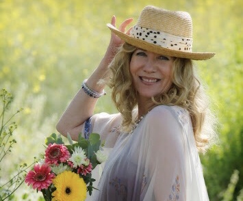
by Adonna Ebrahimi
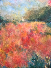
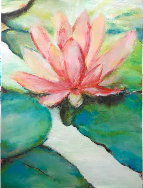
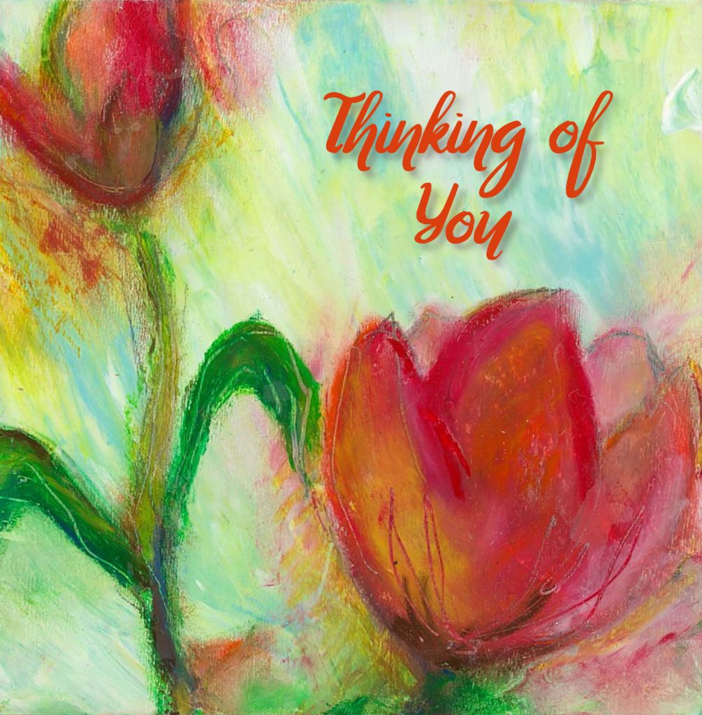
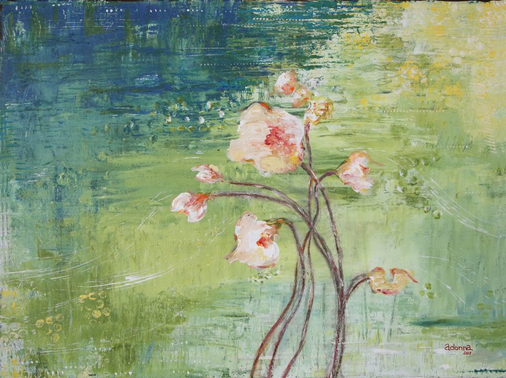
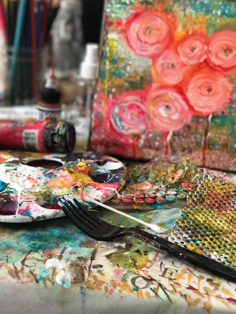
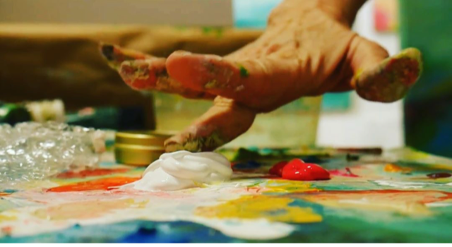
For this body of work, instead of holding a paintbrush, I challenged myself to use natural objects from the outdoors and discarded items from the home. The contrast of these dual sources brings competing energy to the process. I like the pleasant tension. Pressing my fingers into the deep smooth paint and onto the flat coarse canvas sparks a sensation of pure joy and energy and reveals these flowers as I enthusiastically create. I hope you can appreciate this experience and perhaps imagine how you might approach it if given the time and space.
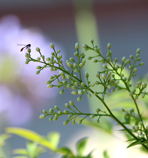
I have always loved flowers, everything about flowers. When I plant them, I wear no gloves. I want to feel the soil as I prepare the space that will ultimately nurture beautiful blooms. I want the touch and the scent of the soil on my hands. It connects me with the focus of my art. Have you ever felt that? If not with soil and flora, then perhaps with some other tactile creation. You of course have.
Flowers have a general, basic design that repeats in thousands of forms. And yet, each one is its own miracle of intricate shape, texture and fragrance. A single flower can compel us to joy. And when one flower combines with some others – of the same species or not – in a single spot, the result can mesmerize an unsuspecting viewer. I seek that power when I paint.
Some of my “tools”. Fork, feather, bubble wrap, credit card, shelf liner, and my fingers, of course 🙂
Bio
Adonna Ebrahimi
Born and raised in the Cincinnati Tri-state area, Adonna relocated to the West Coast in 1998 and began her professional art career. After being introduced to commercial art through a vocational – technical program in high school, she knew at a young age art was her calling. While working for small advertising agencies in Northern Kentucky and New Jersey she raised a family while eventually being led back to what she has always held dear in her heart, creating original art. Adonna’s mission is to create art that inspires and uplifts people in their sacred space.
Working out of her studio at H Gallery & Studios off Main Street in mid-town, Ventura, CA, Adonna invites collectors inside by appointment. She shares new work on social media platforms, Instagram and Facebook, and you can find her @ArtistrybyAdonna as well as on her website, www.artistrybyadonna.com.
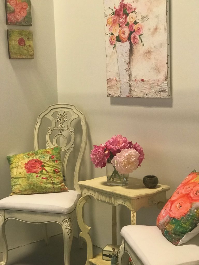
Her floral interpretations invite you to experience her love of flowers and transmits onto canvas unique tools found in nature and one’s household versus standard brushes. This has resulted in a body of work that prompts viewers to take a much closer look.
 I thought the day would never come when I would start posting old photos, but here I am in 2019, and mysteriously, this 35-year old gem rose to the top of my flat files.

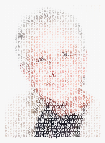 Searching for a definition of “typophile,” I ultimately found one that suited my purpose at

 If it’s Thursday, it must be throwback time.
 .
.